

I didn’t set out to make a digital product. I just had a deck — forty-two slides of “AI basics” that I’d put together for the Western Hardwood Association. It worked well in the room. But when it was over, I caught myself wondering if it could be something more.
That’s when I asked: “how could this be turned into a basic downloadable file with examples and things that would make it more generally accessible to a wider audience?”
That question cracked it open.
At first, I thought maybe I could just clean up the slides and export them as a PDF. Easy. But the truth is, presentation slides aren’t built to live outside the room. They’re skeletal. A line here, an image there. The magic was in my voice filling the gaps. Without that, it felt thin.
So I started pulling at the problem. What if this wasn’t just a deck, but a companion guide? Something people could keep open on their screen, with prompts they could copy straight into an AI. I even asked, “i see it as a companion to have up on your screen. maybe a different format would be better?”
That’s where the style questions came in.
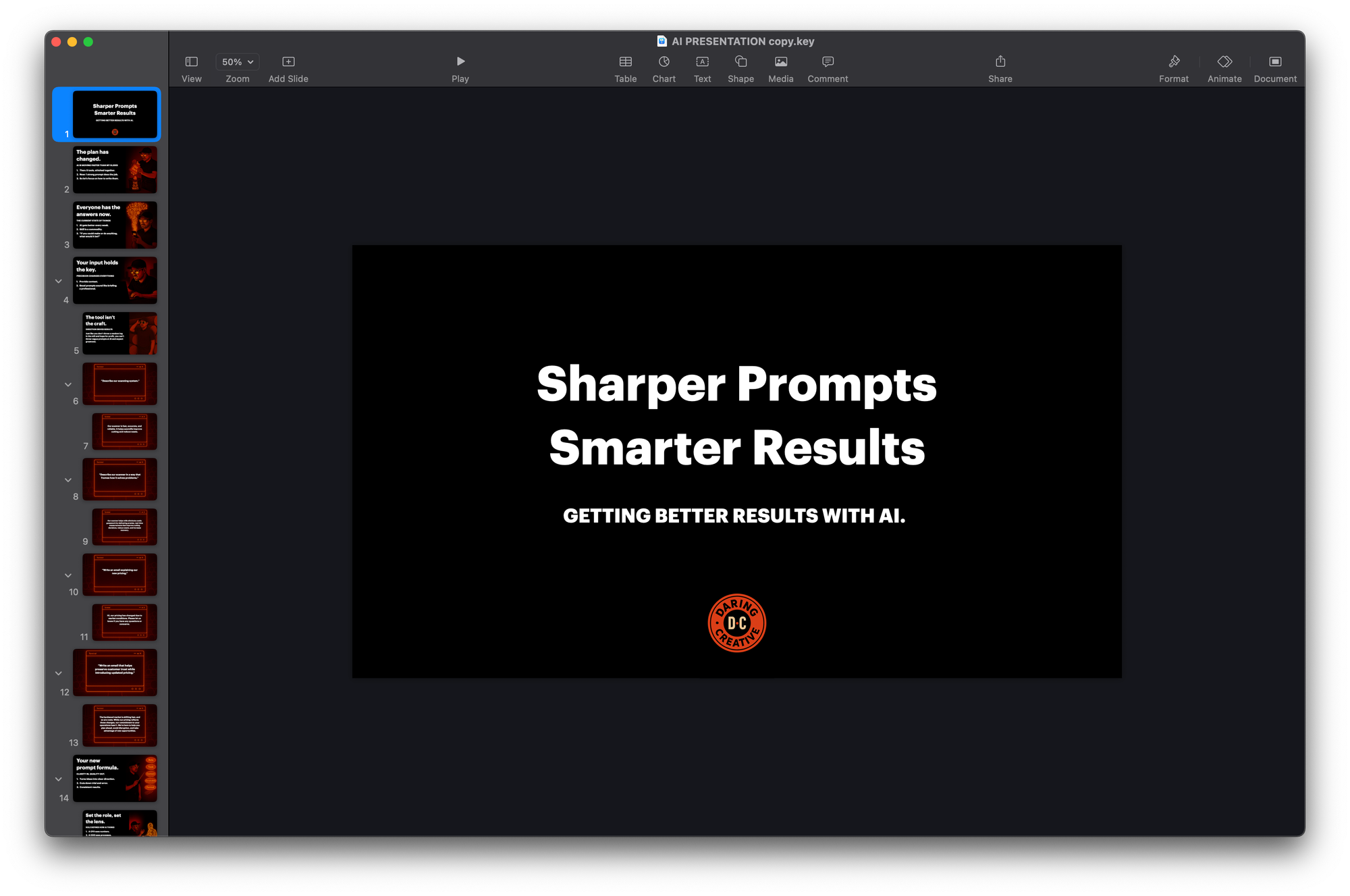
The headline on the deck read: “Sharper Prompts, Smarter Results.” But even that bugged me. “i want a different headline for the guide. we have sharper prompts, smarter results but its long and i dont like the , in the middle.”
And I was right to feel that itch. A headline is a handle — too clunky and nobody picks it up. We batted around alternatives: Clarity In. Quality Out. felt sharper. The Prompt Playbook felt friendlier. Naming forced me to face what this was: not just notes, but a field guide.
Once the intent was clear, the format followed. I didn’t want this to read like a manual. I wanted it to read like me. So the structure became:
- Title
- Subhead
- Copy (expanded, story-driven, plainspoken)
- Bullets (distilling the idea)
- Example Prompt (ready to copy)
I’d said it myself: “i think what i am looking for is like: Page 1 Title, Subhead, Copy, Summarized bullet points, Example prompts.”
That rhythm gave the guide its backbone.
From there, I started revisiting each section.
“Be clear on the task.” I wrote about asking AI for “help with branding” and getting back mush. Then I told the story of when I finally asked, “write me a two-sentence positioning statement for a resin art studio” — and the results sharpened instantly.
“Load in the context.” I remembered resin copy coming back like I was selling craft supplies, until I added, “Frame this for an audience used to buying fine art, who may not understand resin.” Suddenly the words matched the world.
“Constraints sharpen output.” That came straight from trying to wrangle sculpture descriptions. The moment I said, “under 75 words, plainspoken,” the language stopped drifting into academic fog.
That’s how every page became part story, part tool.
Then came the makeovers — the before/after prompts.
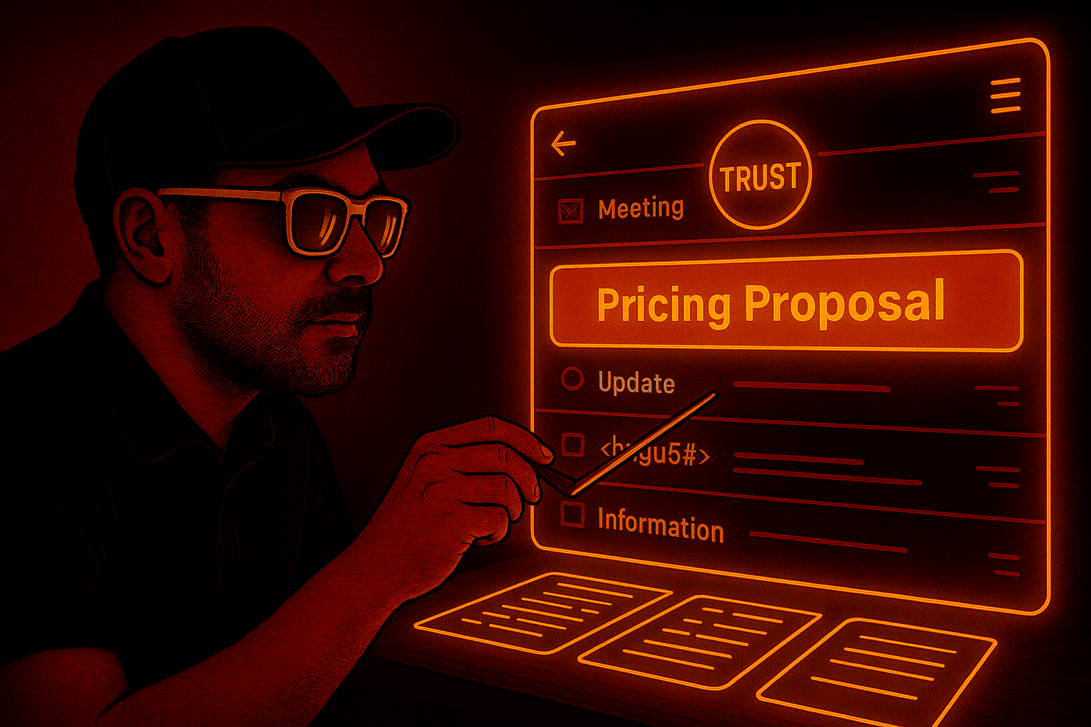
I’d asked AI, “Write an email explaining our new pricing.” The result? A stiff notice that might as well have been taped to a bulletin board. When I reframed with role, context, and tone, it turned into something warm and trustworthy.
I wanted the reader to feel that difference. Not just see the formula, but experience it.
Scenes from the Prompt Playbook.
Still, I couldn’t shake the need to make it approachable. I said it out loud: “i want this to be of high utility. the kind of thing someone might say, wow i cant believe this was a freebie.”
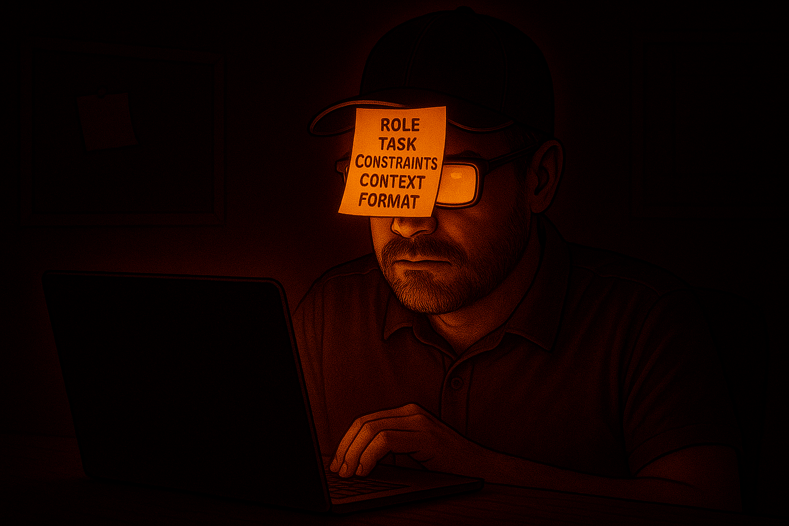
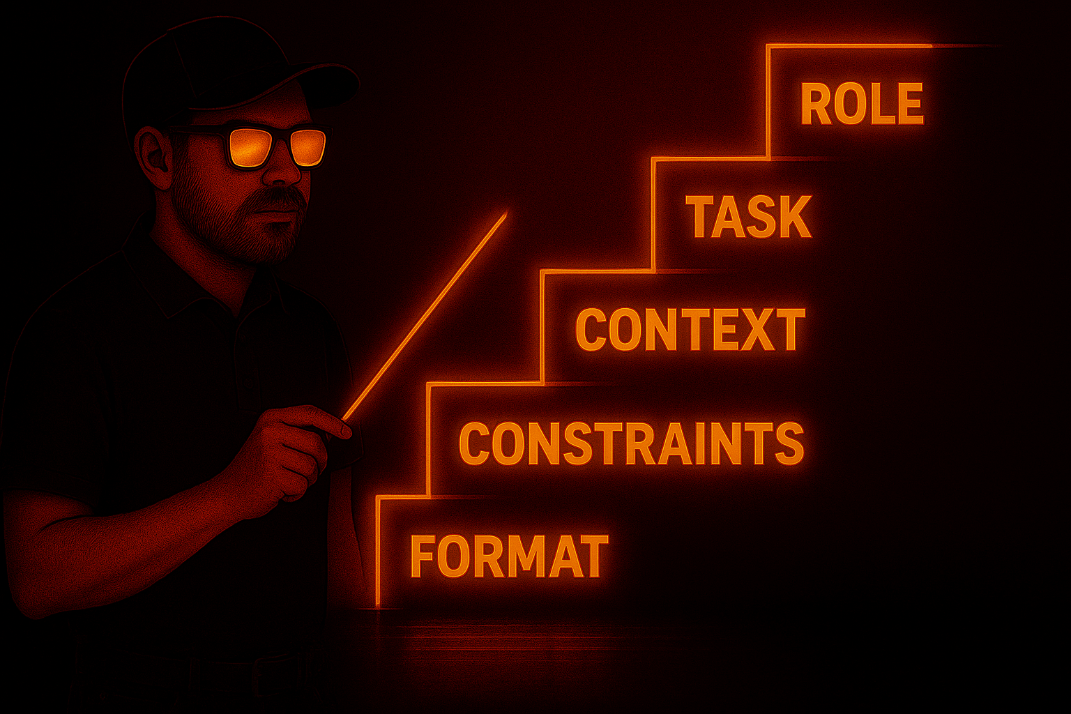
That meant cheat sheets and exercises. Pages where you could type in your own prompts, not just read mine. A one-pager with icons for Role, Task, Context, Constraints, Format — something you’d screenshot and tack to your desktop.
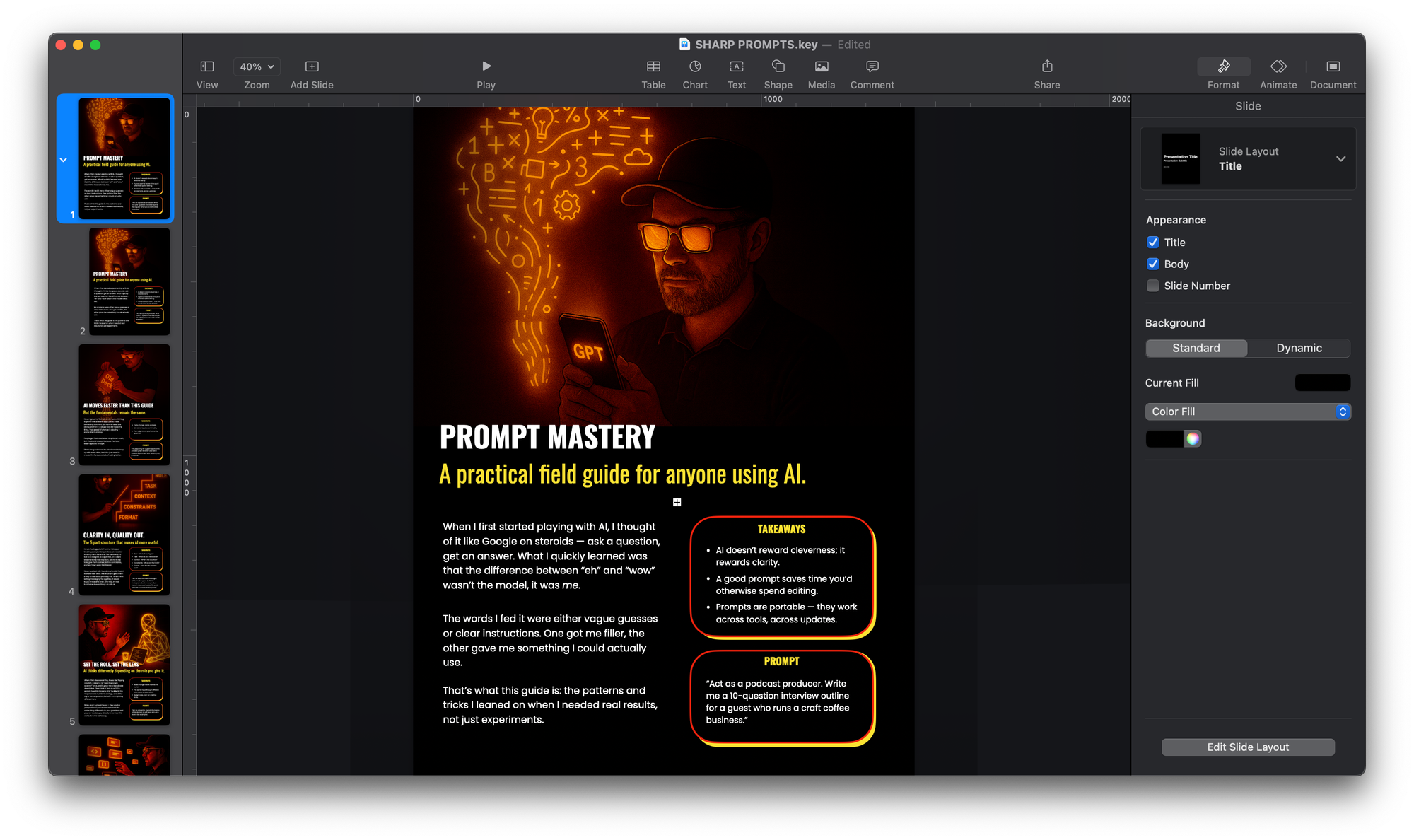
And I didn’t want it to look like every other PDF out there. I asked, “how about an image representing how you see a page looking?” The answer was a split layout: story on the left, boxed prompt on the right, bold orange titles glowing against a black background. Functional, but cinematic.
The style questions went deeper. Fonts mattered. I caught myself asking: “wha nmight be good fonts to use for this?” Because the wrong font kills utility. Too ornate, people won’t read. Too plain, it feels like homework.
We landed on a pairing: a bold display font for titles (Bebas Neue, Anton, Oswald) and a clean sans-serif for body copy (Poppins, Inter, Work Sans). Prompts would sit in a monospaced box, like a code snippet, signaling: “copy me.”
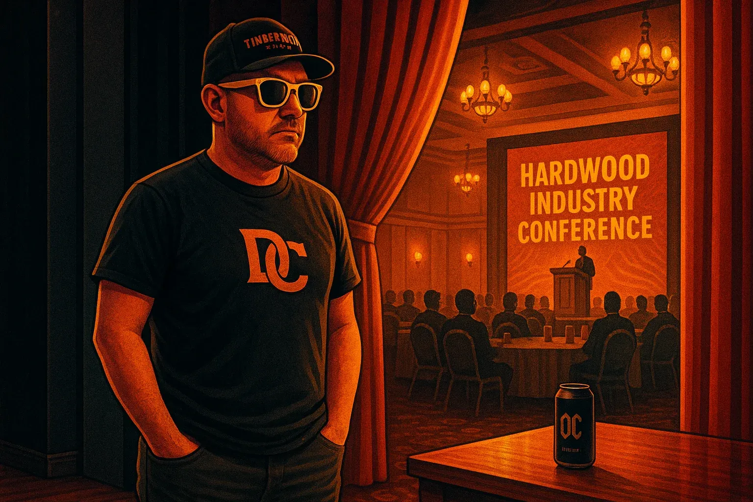
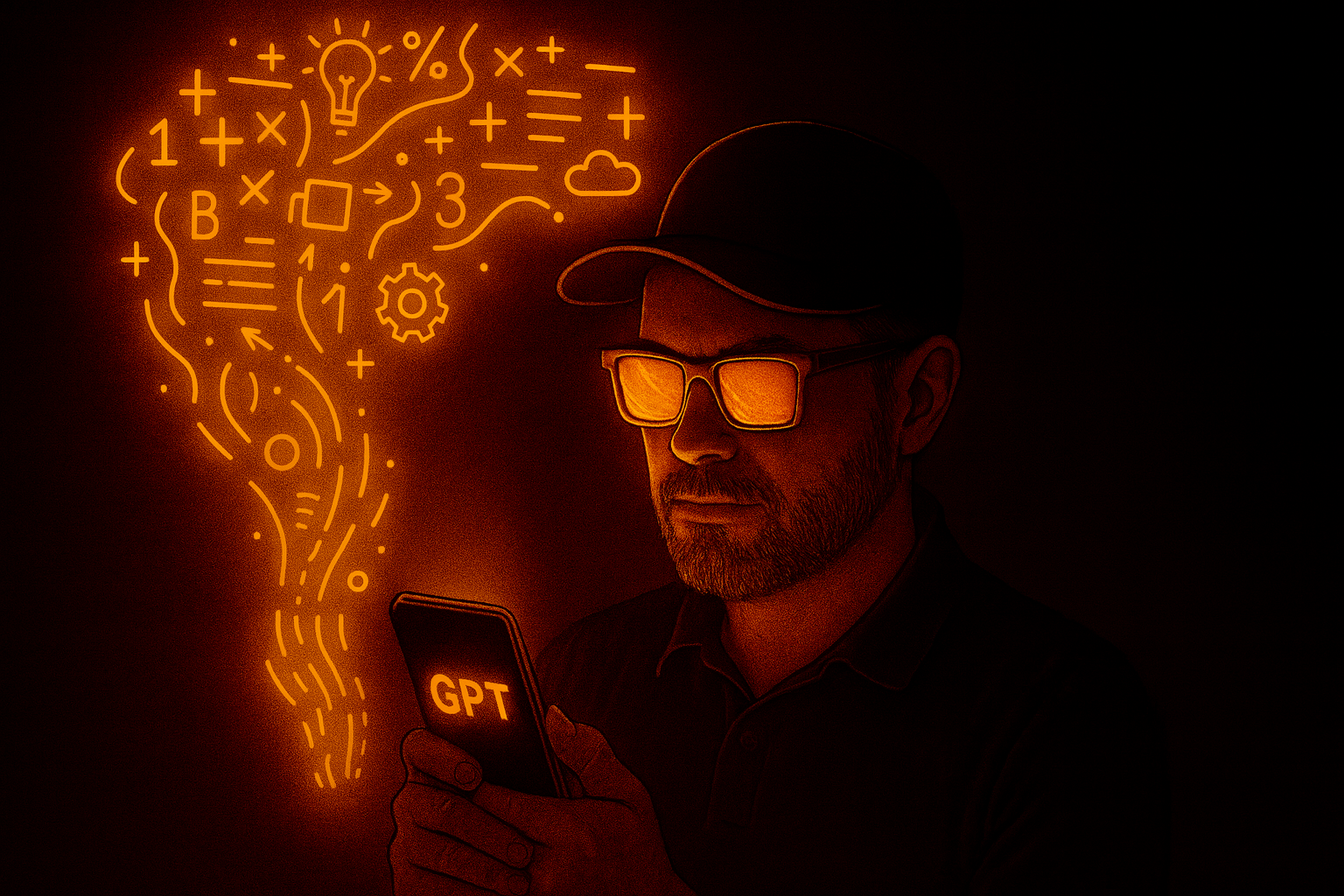
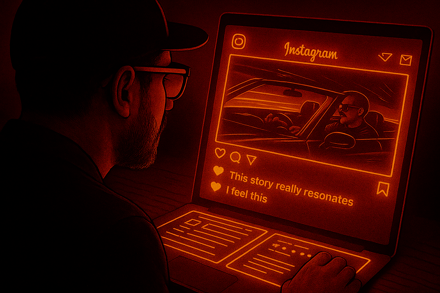
Even visuals got cinematic. I started slotting the man in yellow sunglasses — my neon-noir anchor — into scenes: wiring glowing cables for the JSON page, surfing a neon wave for “Adapt Fast,” unrolling a glowing scroll for the appendix. Then I asked for more: “i wanted alternates for all of these slide ideas.”
Now every key page had two possible scenes. Chef in a neon kitchen, jars glowing with “context.” Pilot in a neon cockpit, map lines streaming. Librarian pulling glowing cards. Payphone buzzing in the night.
These images gave the guide personality, without drifting into gimmick.
Looking back, the biggest challenge wasn’t the content. The slides already had that. The challenge was style. Making it more widely approachable. Pulling it from the narrow world of hardwood scanners and into something anyone could use.
Every time I felt stuck, I went back to the same line: clarity in, quality out. That applied to my own process as much as the prompts.
Now, as I get ready to share it on the site as Daring Creative’s first free digital product, I realize this isn’t just a guide. It’s a statement of approach. A behind-the-scenes look at how I wrestle things into clarity.
What started as forty-two slides became twenty-five pages of stories, examples, exercises, and prompts. A workbook, not a deck. A companion, not a handout.
And the whole thing started with a single question:
“how could this be turned into a basic downloadable file with examples and things that would make it more generally accessible to a wider audience?”
That was the moment a talk became a tool.