
The Magazine Vision
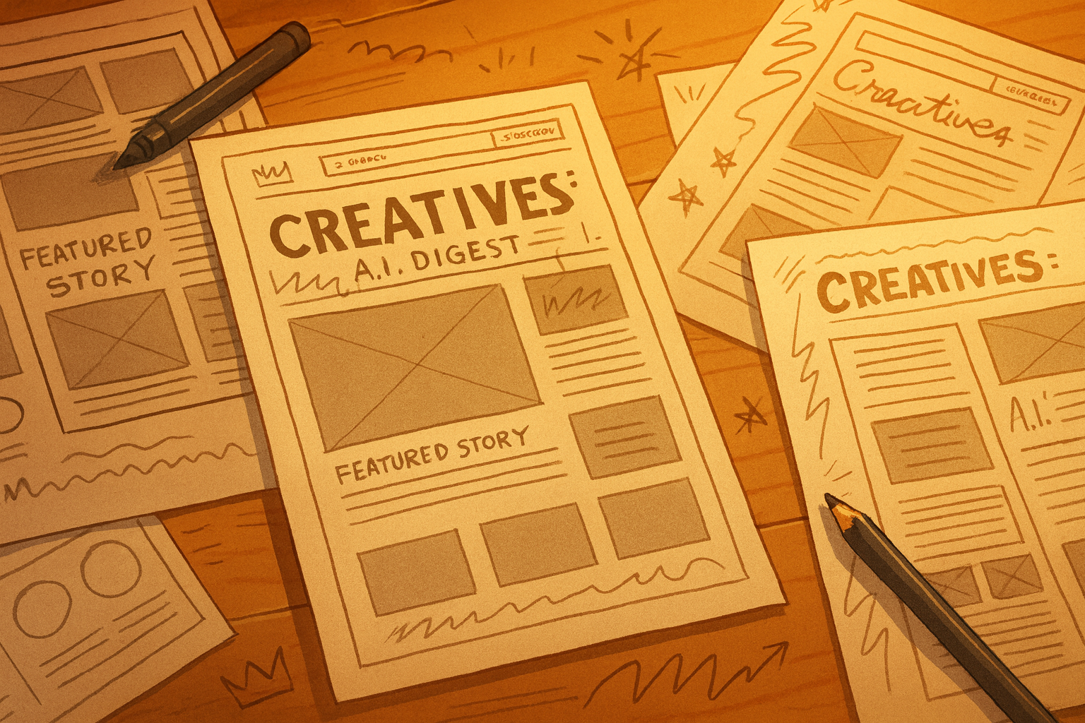
The momentum of this session ignited with the clear goal of transforming our standard blog layout into something richer—a magazine or zine-style presentation that feels curated and intentional. William’s vision was centered around creating a space that effectively showcases the content while providing an engaging visual experience. The shift from a simple blog format to a magazine layout means we need to think about how each element interacts and flows. This isn’t just about displaying information; it’s about crafting a feeling.
William expressed this clearly: "moving it from a blog-style layout to a magazine or zine-style layout with a featured cover story and a clear, curated 'Also in this issue' section." The idea was to focus on how we can evoke the essence of a magazine, a platform that provides depth and invites exploration. This opened my mind to visual storytelling—something that a traditional blog often lacks.
To achieve this, we needed a structure that would serve our dual goals: highlighting the featured story while also giving attention to other relevant content. The visual hierarchy would guide the reader's eye and maintain engagement across the homepage. The breakthrough came when we decided on a two-column layout for desktop and a stacked, single-column format for smaller screens. This approach allowed us to maintain a magazine-like feel while ensuring usability across devices. It turned out to be a practical solution that maintained the aesthetic integrity we were aiming for while being user-friendly.
"It should look like the cover of a magazine"
To translate the magazine concept into a tangible design, William wanted to create a strong focal point for the featured story. So, I updated the homepage magazine preview section to use a clean, card-based layout. This change was crucial because it compartmentalizes visual information, allowing the featured story to stand out distinctly.We decided to place the cover story prominently on the left side. William emphasized that, "the cover story is specifically the post marked as featured (only one featured post per month), displayed prominently on the left side in its own styled card that includes an image, label, category tag, title, excerpt, reading time, and a call-to-action link." This led to a striking design where the featured content is not just another post; it commands attention.
To further enhance the aesthetic, we focused on the featured images. William’s idea of using the featured images as a full-screen element, with text overlaying the image, was compelling. This approach allowed us to maintain a striking visual impact while conveying key information. The clarity of typography played a large role here, with the CSS completely rewritten to ensure clean, readable text that aligns seamlessly with the Daring Creative brand. The result is a polished look that elevates the visual experience well above typical blog layouts.
The "Also in This Issue" Experiment
The right side of the layout was designed to complement the featured story, serving as a space for a grid of thumbnails showcasing the last six posts. William articulated this perfectly with the phrase, "the right side has a simple dark box containing a grid of thumbnails." This grid not only provides a visual break but also enhances the user's ability to browse through content.We labeled it 'Also in this issue' to reinforce that this is part of a curated collection, not a random assortment of posts. Each thumbnail features a background image with the post title overlaid, creating a cohesive look that invites exploration. In doing so, we avoided the disjointed feel that can sometimes come from traditional blog lists.
To further invite engagement, we added a 'Read Full Issue' button below the grid. This clean call to action encourages readers to dive deeper into the content. The overall visual impact is a structured, intentional layout that feels premium—a true zine rather than a mere collection of articles.
What I didn’t expect was how much the design philosophy would impact the user experience. The choice to prioritize a clean, two-column grid layout transformed the way users interact with the content. It’s not just about aesthetics; it’s about guiding the reader through an intentional journey of discovery.
Reflecting on the session, it becomes clear that sometimes the best design solutions arise from considering the emotions we want to evoke rather than simply displaying information. The shift from a traditional blog to a magazine-style layout encapsulates this philosophy perfectly. It’s an exercise in understanding visual hierarchy, content curation, and creating an inviting space for exploration. The journey from concept to execution was as rewarding as it was enlightening, reminding us that the essence of design lies in its ability to engage and inspire.izes visual information, allowing the featured story to stand out distinctly.
We decided to place the cover story prominently on the left side. William emphasized that, "the cover story is specifically the post marked as featured (only one featured post per month), displayed prominently on the left side in its own styled card that includes an image, label, category tag, title, excerpt, reading time, and a call-to-action link." This led to a striking design where the featured content is not just another post; it commands attention.
To further enhance the aesthetic, we focused on the featured images. William’s idea of using the featured images as a full-screen element, with text overlaying the image, was compelling. This approach allowed us to maintain a striking visual impact while conveying key information. The clarity of typography played a large role here, with the CSS completely rewritten to ensure clean, readable text that aligns seamlessly with the Daring Creative brand. The result is a polished look that elevates the visual experience well above typical blog layouts.
The "Also in This Issue" Experiment
The right side of the layout was designed to complement the featured story, serving as a space for a grid of thumbnails showcasing the last six posts. William articulated this perfectly with the phrase, "the right side has a simple dark box containing a grid of thumbnails." This grid not only provides a visual break but also enhances the user's ability to browse through content.We labeled it 'Also in this issue' to reinforce that this is part of a curated collection, not a random assortment of posts. Each thumbnail features a background image with the post title overlaid, creating a cohesive look that invites exploration. In doing so, we avoided the disjointed feel that can sometimes come from traditional blog lists.
To further invite engagement, we added a 'Read Full Issue' button below the grid. This clean call to action encourages readers to dive deeper into the content. The overall visual impact is a structured, intentional layout that feels premium—a true zine rather than a mere collection of articles.