William sat in front of his monitor with the homepage open again. He studied it with the quiet focus of someone who had circled the same thought for weeks without naming it. The air held a tension that was not stress, just inevitability.
It was time to figure out what the site wanted to become.
What is this site actually supposed to feel like?
WILLIAM:
I don't want this to feel like a blog anymore.
CHATGPT:
Alright. If it is not a blog, then what is it supposed to be for you? What experience are you trying to create when someone lands here?
It was not frustration. It was recognition. The kind that arrives once an idea is finally spoken clearly enough to follow.
William leaned back, still looking at the screen.
WILLIAM:
A magazine. Something curated. Something intentional. A place that feels like an issue, not a feed. A cover story that sets the tone. A layout that invites someone to explore. Something more like a glossy magazine?
CHATGPT:
Then the structure has to behave like that. Clean hierarchy. Clear pacing. A focal point that acts like the first page of something, not the top of a list.
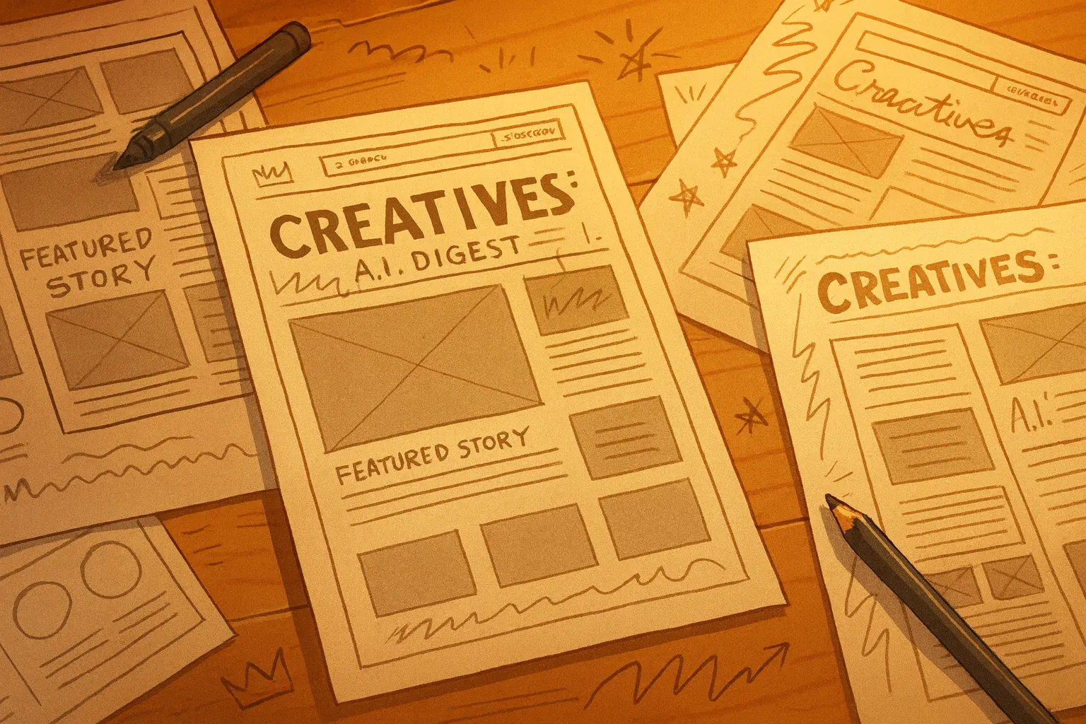
William was not trying to post more. He was trying to publish with more meaning. The shift was subtle but complete. He clicked around some other mockups, looking for more inspiration and a direction.
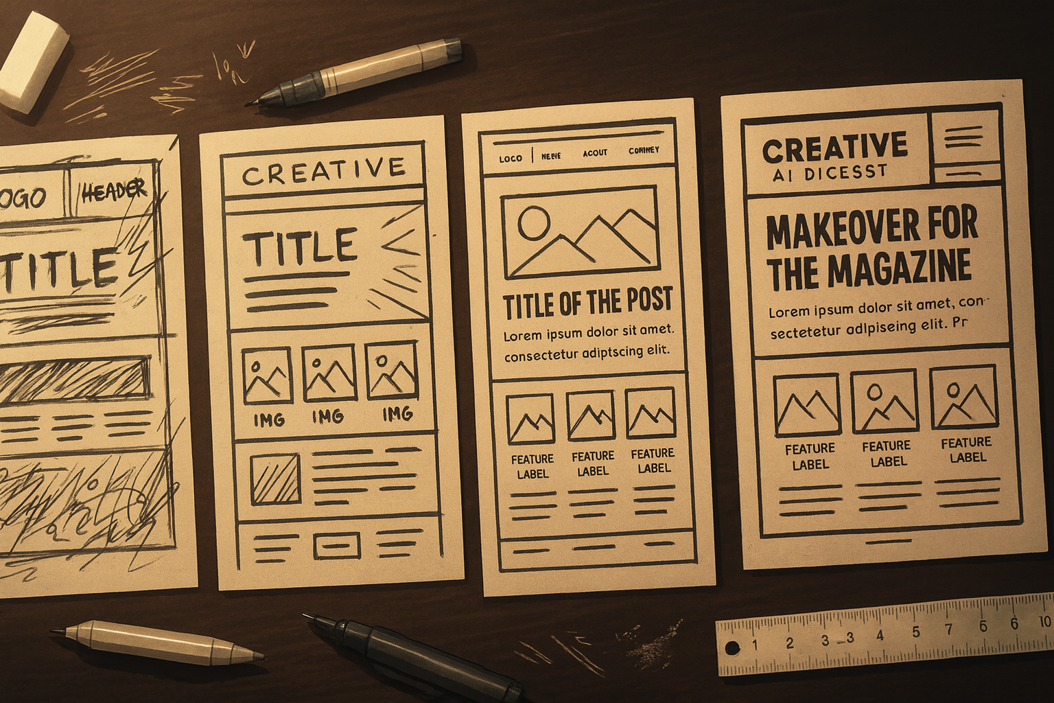
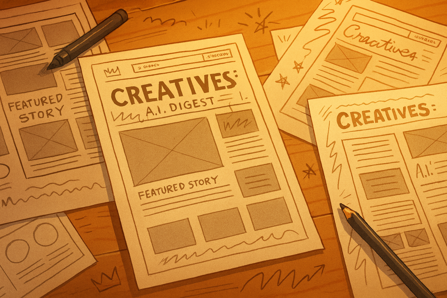
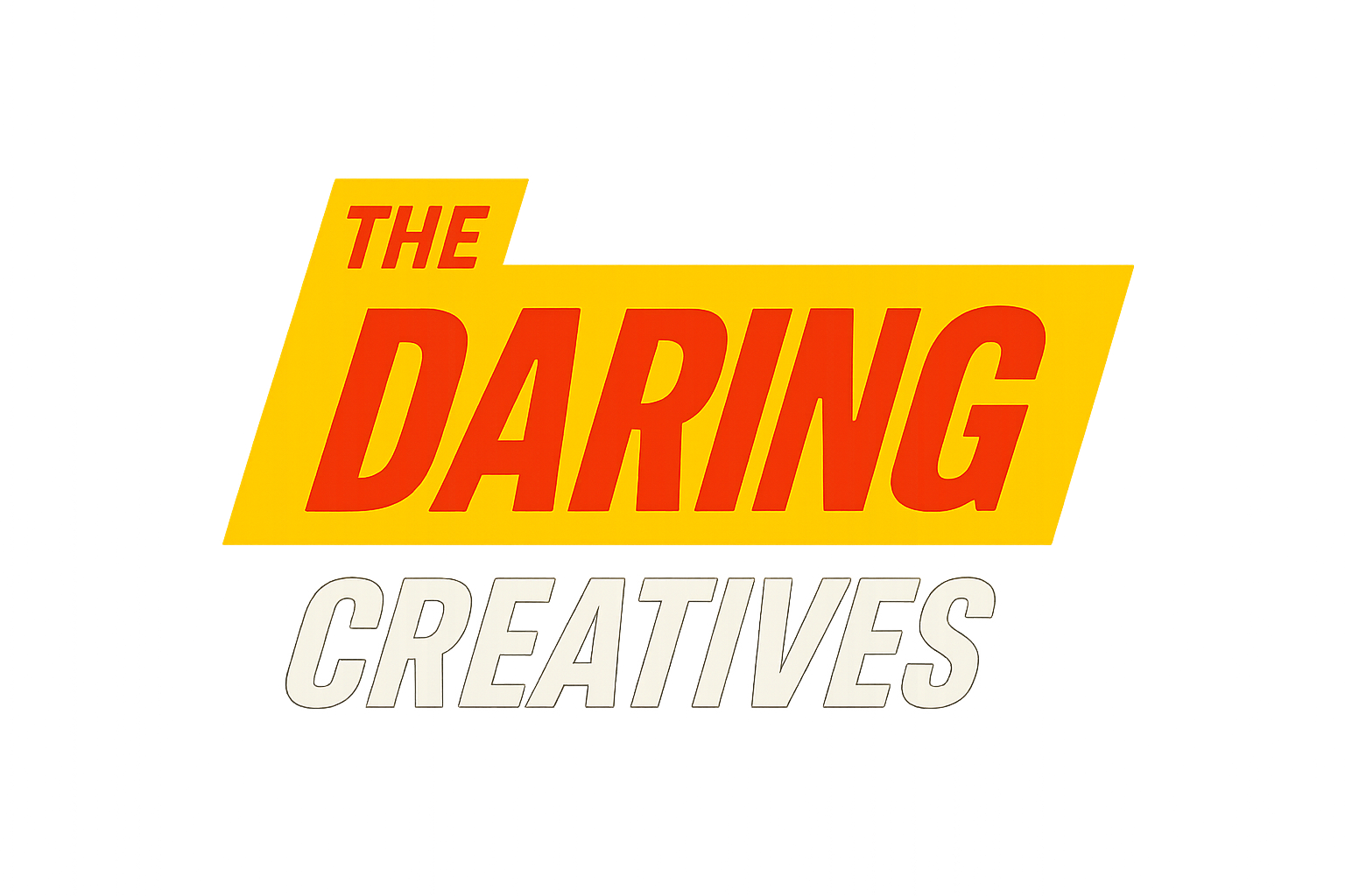
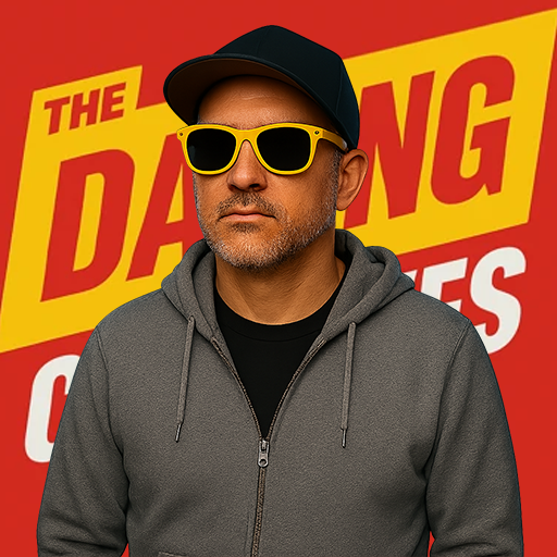
Early mockups and visualizations for the progression of The Daring Creatives.
What role does the featured story actually play?
WILLIAM:
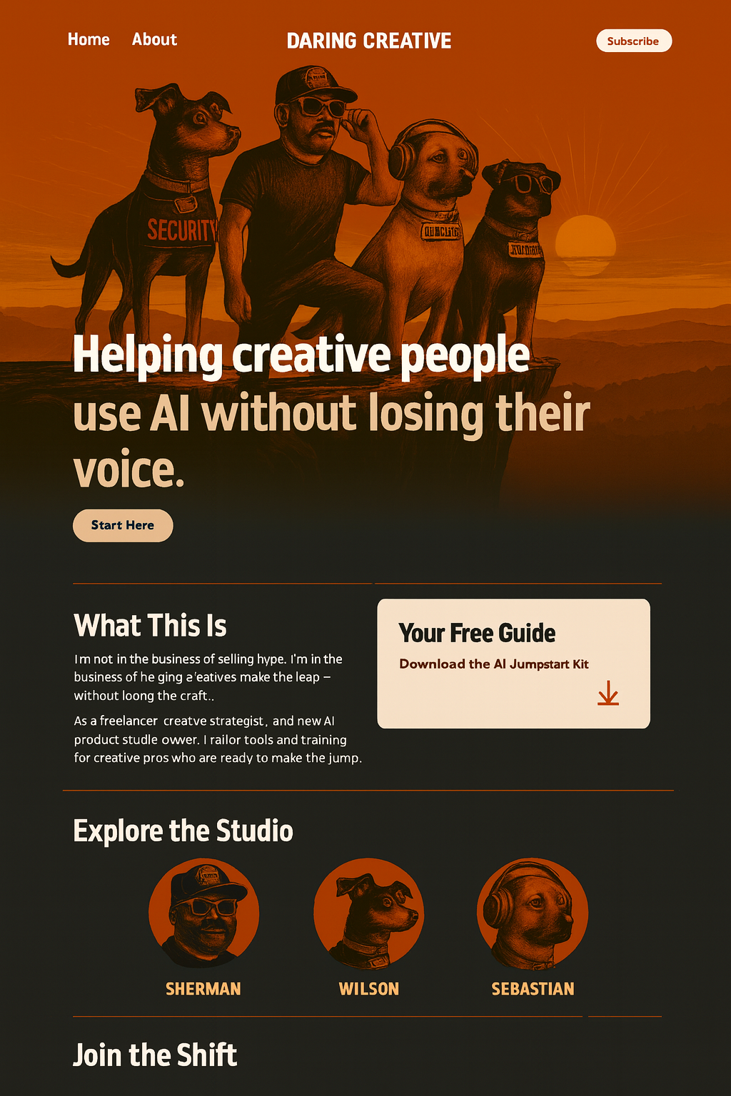
When you visit the home page, I want it to look like a magazine. Only one post per month gets that treatment. It needs presence. It needs space. It needs to feel like the reason you showed up.
CHATGPT:
Then give it the posture of something that matters. Use scale. Use contrast. Let the image take up real room. Let the typography stand on its own without squeezing for space.
William nodded to himself. He was not trying to display content. He was trying to honor it.
How should the rest of the homepage support the cover?
WILLIAM:
I also want to preview what else is in the issue, because it might not make immediate sense when people come to the site and only see 1 article. I want a simple grid of six posts. Enough to explore but not enough to feel messy.
CHATGPT:
Six works. It feels deliberate. It gives the reader a sense of what belongs in this issue without overwhelming them. You are building a rhythm, not a catalog.
William exhaled slowly, a small smile playing at the edge of his expression. It was the kind of smile that comes from realizing the problem was never the content itself. It was the frame.
What should the homepage look like when everything fits?
WILLIAM:
It should look like the cover of a magazine. That feeling when you pick one up and know immediately which story matters most.
CHATGPT:
Then the page should carry itself with confidence. Space where it is needed. Restraint where it matters. A layout that feels calm and sure of itself.
William adjusted spacing and alignments with slow, deliberate motions. Gemini refined the deeper structure, creating patterns that felt consistent and sturdy.
By the time the layout snapped into place, something fundamental had shifted. The site no longer felt like a list of thoughts arranged by date. It felt like a monthly lens. A perspective. A publication.
The CSS followed naturally. Larger imagery. Clean type. Clear hierarchy. Space that allowed the eye to rest.
Why did the typography need to change?
The homepage had its shape now, but something still felt off. The text did not carry the same confidence as the layout. It behaved like it was still living inside a blog template.
William noticed it first.
WILLIAM:
The type is too cramped. It is not matching the mood of the layout. It needs to feel quieter. Cleaner. More deliberate.
CHATGPT:
Then rewrite the typography system. Larger line height. More contrast. Fewer competing weights. Let the words sit comfortably in the space they occupy.
Nothing dramatic. Just slow refinement. He was trying to create the feeling of a magazine without pretending to be print.
How did mobile shape the final layout?
Once the desktop version felt solid, William resized the window. Mobile told a different story. The layout stacked, but the hierarchy got muddy.
He frowned slightly.
WILLIAM:
The cover needs to come first on mobile. Clean and simple. But it cannot feel squeezed. It needs the same sense of intention. I hate when the mobile version sucks.
CHATGPT:
Then give it the entire top section. One column. Large image. Clean title. Do not force desktop logic onto a phone screen. Let mobile have its own clarity.
Gemini adjusted the breakpoints. Mobile became its own version of the magazine. Not a compromise. Just a different reading experience.
The issue grid sat neatly below the cover. Six small cards. Clean labels. Enough to scroll without losing the thread.
The layout finally felt universal. The magazine feeling held up on every device.
When did the idea of “issues” become real?
William scrolled through the finished draft of the homepage. The monthly rhythm felt tangible for the first time.
He spoke almost to himself.
WILLIAM:
It actually looks like an issue. A real one. I really like this!
CHATGPT:
You stopped thinking about individual posts and started thinking about how they live together. That shift changed the entire posture of the site.
Issues were not a feature. They were a mindset.
WILLIAM:
This feels like me. This feels like how I think. Calm, intentional, not frantic. It feels like a place I would actually want to land on.
CHATGPT:
Then you built the right thing. The site is not louder. It is clearer. Your work reads differently when the container respects it.
The homepage was no longer a blog. It had finally become a magazine.